
Responsive Web Design Services
Web designs that adjust smoothly to any screen, from phones and tablets to large monitors.
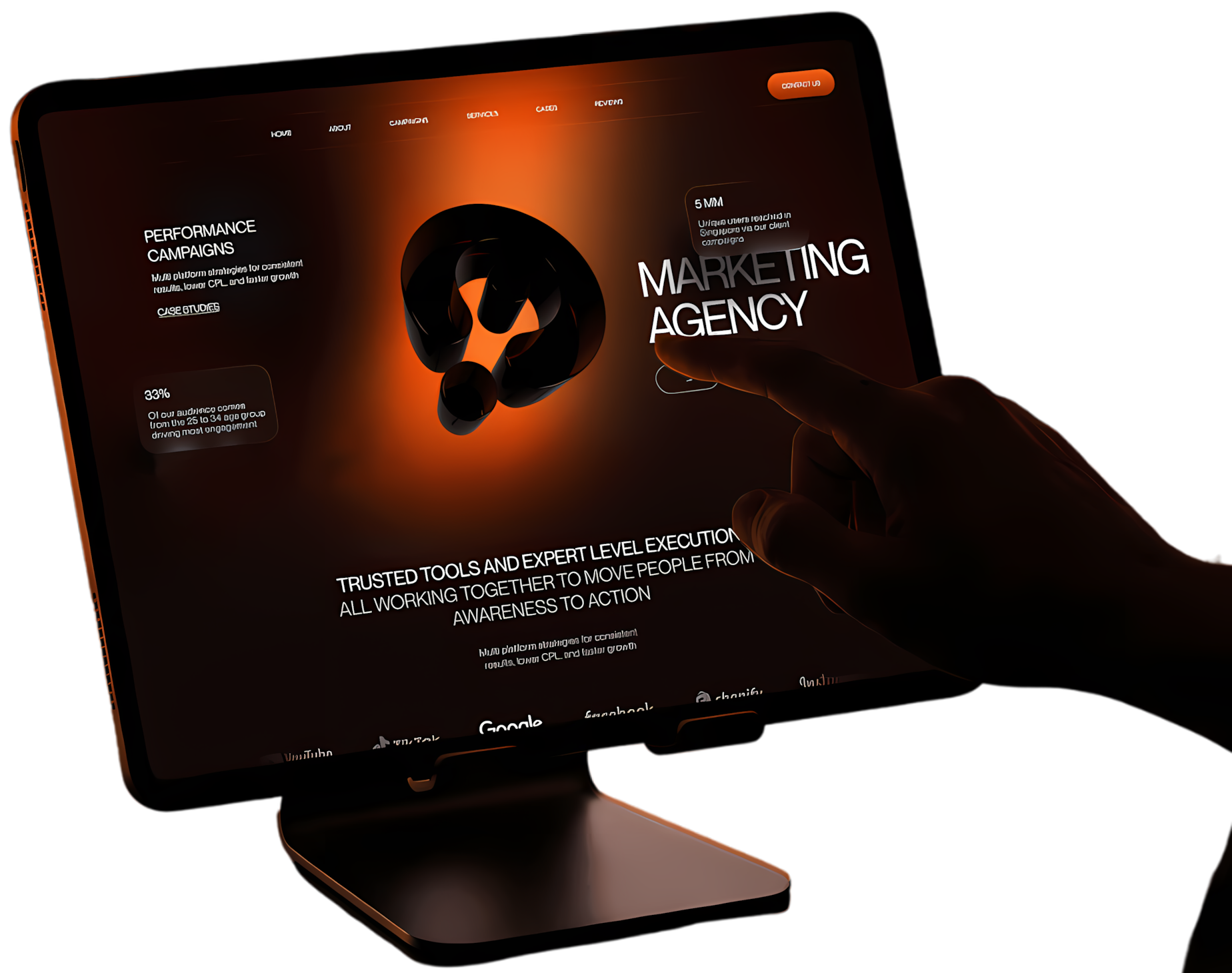
Trusted by product teams across industries









Selected work
Real projects, real results
A snapshot of products, platforms, and brands we've designed and shipped for ambitious companies.

The Law Firm
Website design, brand identity, digital presence
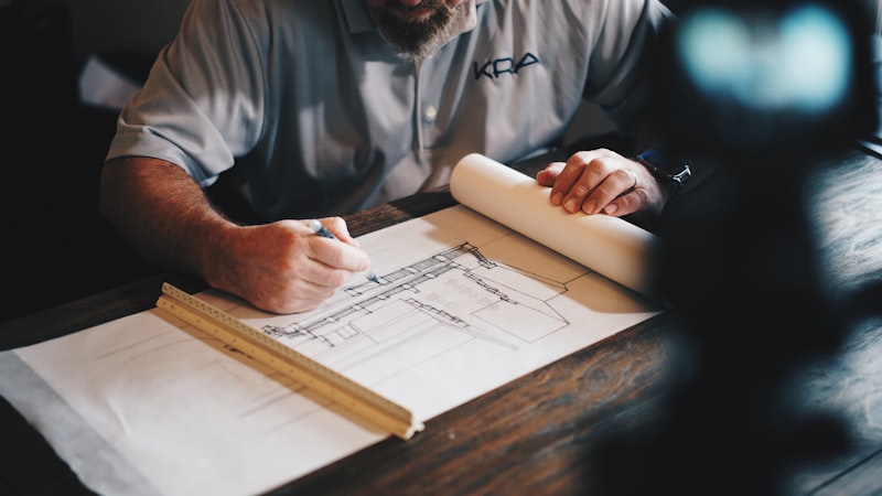
The Paving Company
Website design, lead generation, digital marketing
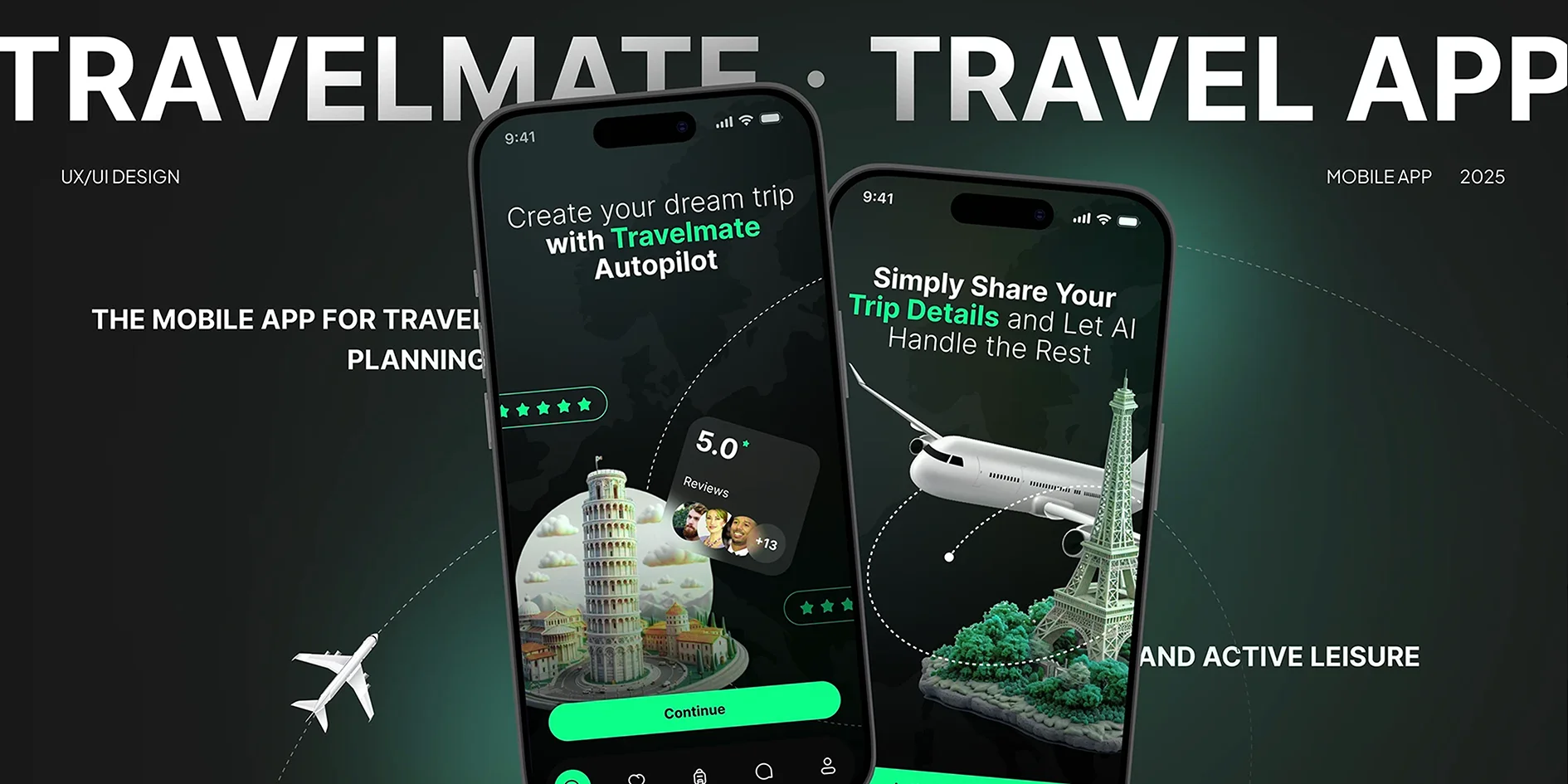
TaskFlowPro
Cross-platform app, Dashboard design
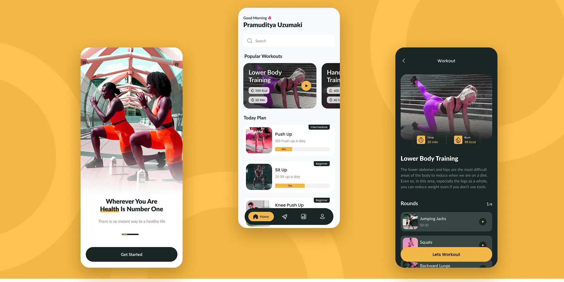
FitSync
Flutter app, UX/UI, Wearable sync
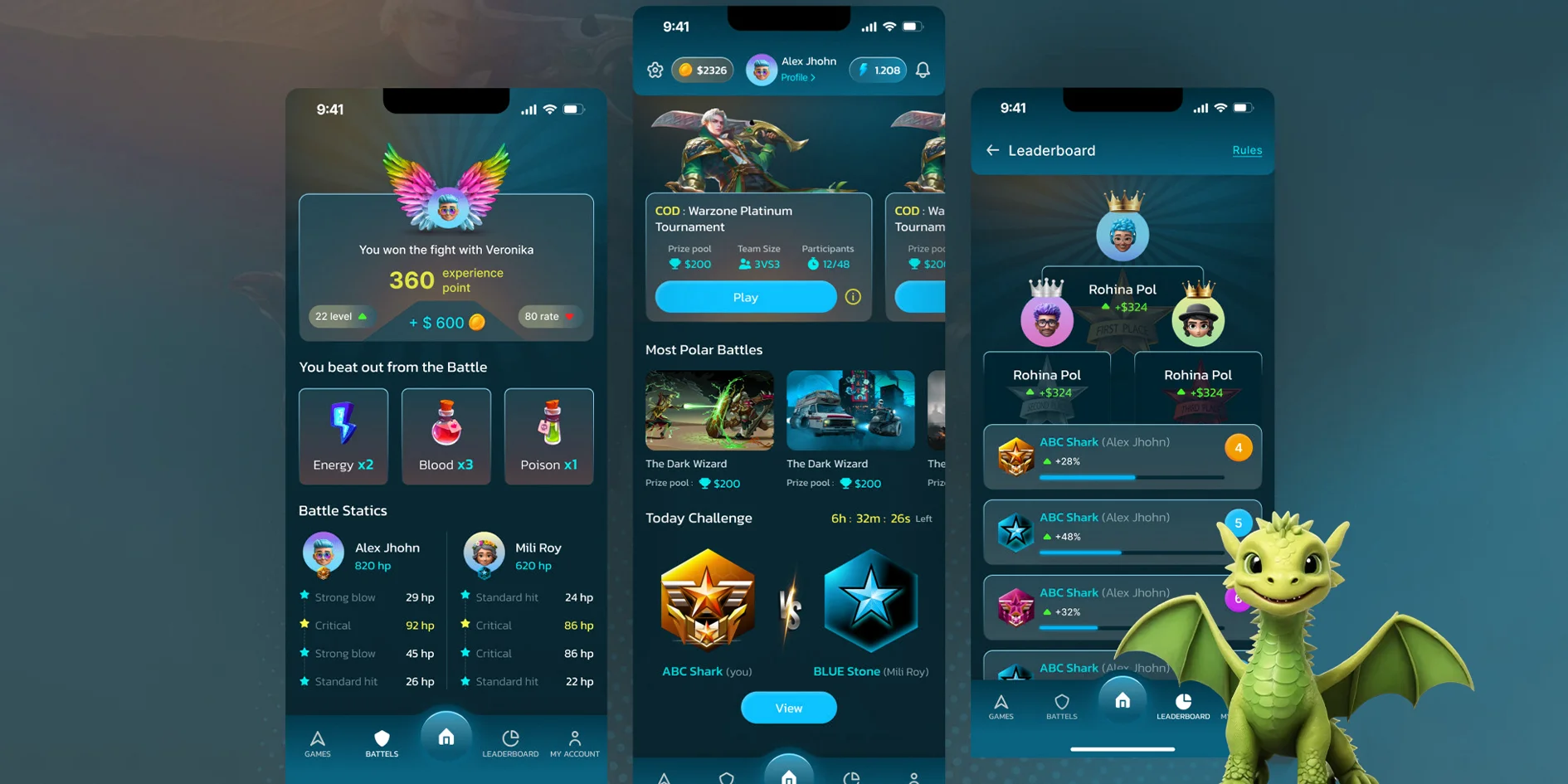
PixelQuest
Game development, Motion design
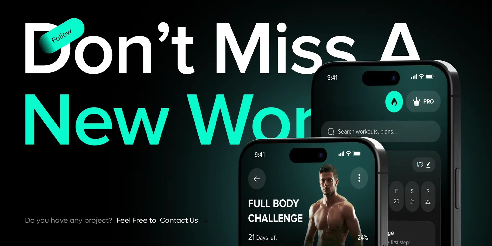
FitPulse
iOS app, HealthKit, Analytics
Our Responsive Web Design Services
Custom Responsive Layout Design
We build layouts that are not just mobile-friendly but also device-smart. Every section is designed to shift, stack, and scale smoothly based on screen size without losing clarity or usability.
Mobile-First Design Approach
We start with small screens in mind — focusing on quick load times, easy tap targets, readable text, and smooth scrolling. The result is a site that feels right on mobile from the start.
Tablet and Desktop Optimization
We don’t stop at mobile. Your site is tested and optimized for tablets, laptops, and widescreen monitors to ensure every layout looks clean and professional everywhere.
Clean Code and Lightweight Structure
Our development avoids bloated themes and extra add-ons. We focus on clean, optimized code that improves loading speed, lowers bounce rates, and keeps your site smooth.
Content Adjustment and Visual Hierarchy
We reorganize your content based on screen size. Important headlines, buttons, and images always appear in the right order — improving flow, engagement, and usability.
Ongoing Design Edits and Adjustments
As your website grows, we help you maintain responsive consistency. Whether adding new pages or features, our team ensures your site keeps working across all screen sizes.
Have a project in mind?
Share your goals and we'll map out the fastest, most reliable path to ship them — with a clear scope, timeline, and estimate.
Start a conversationAbout Our Responsive Web Design Services
With responsive web design, your site doesn’t just shrink to fit — it transforms to deliver the best possible experience to every visitor, wherever they are. We understand what your users expect when browsing from their phone or switching to a tablet, and we build your website to meet those expectations without compromise.

Our Methodology
A Structured Process to Deliver Exceptional Responsive Web Design
Understand Your Users and Devices
We analyze your audience and traffic sources to identify the most-used devices — so your design focuses on real user behavior from the start.
Sketch Layouts with Flexibility in Mind
We use grid systems and modular content blocks to create layouts that scale naturally across screen sizes while maintaining hierarchy and clarity.
Develop with Clean, Scalable Code
We write responsive HTML and CSS that stays smooth across breakpoints. No bloated code, just scalable structure that adapts and performs.
Adjust Content and Images Per Device
We optimize content blocks, images, and interactions so they look and work their best on each device — enhancing both usability and speed.
Test on All Common Devices and Browsers
From iPhones and Androids to tablets and desktops — we test your site on modern browsers and real devices to catch bugs before launch.
Optimize for Speed and Mobile SEO
We compress images, load assets efficiently, and implement mobile-first SEO practices that help your site perform and rank better.
Launch and Walk You Through Edits
Before going live, we train you to manage the site — how to edit content, add new sections, and preview changes across device sizes.
Offer Ongoing Help as Your Site Grows
We’re available to adjust layouts, add pages, and maintain responsive consistency as your content evolves and business grows.
Where we work
Industries we serve
Deep experience across the sectors shaping today's digital economy.
Top Web Development Agency
Clutch 2025
Best Mobile App Developers
DesignRush 2025
Rising Stars of Software
GoodFirms 2025
Top Rated SEO Agency
Bark 2025
Client voices
What our clients say
“Nexstack took our half-finished idea and shipped a polished product in weeks. Their team communicated clearly at every stage and the final result exceeded what we imagined.”
Ayesha Khan
Founder, TaskFlowPro
“The redesigned store paid for itself within the first quarter. Conversion-focused design and fast performance made an immediate, measurable difference to our revenue.”
Daniel Okafor
COO, StyleNest
“Rare to find a partner that handles strategy, design, and engineering under one roof. Our SEO-driven growth finally became predictable and sustainable.”
Marcus Lindqvist
Growth Lead, BrightTech
“From the first wireframe to launch, Nexstack kept us in the loop and delivered on time. The mobile app they built feels effortless — our users noticed immediately.”
Sara Mahmood
Product Manager, FitPulse
“They rebuilt our entire platform for a global audience without losing any performance. Localization, architecture, and UX — all handled with real care.”
Lucas Moreau
CTO, GlobalReach
FAQs
Frequently Asked Questions About Responsive Web Design Services
What is responsive web design?
Why is having a mobile-friendly website important?
Can you make my existing website responsive?
How long does a responsive web design project take?
Will my site load fast on mobile devices?
Ready to give your website a responsive design that works everywhere?
Get in touch with our responsive web design experts today and let’s build a site that looks great on every screen!
Let's talk