


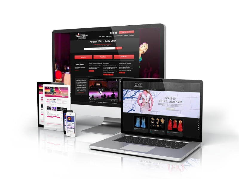
Responsive Web Design
Responsive Web Design Services
One Website, Every Device, Perfect Experience. We build fluid, adaptable websites that look and perform flawlessly on screens of every size.
Fluid Responsive Design for
Every Screen Your Visitors Use
We create responsive websites that automatically adapt to any screen size—desktops, laptops, tablets, and smartphones. Our responsive web design services ensure your content is always readable, navigation is always accessible, and calls-to-action are always within reach. No pinching, zooming, or horizontal scrolling. Just a seamless experience that keeps visitors engaged no matter how they access your site.


Our Full-Cycle Responsive Web Design - Services
Mobile-First Responsive Design
We design for the smallest screen first, then progressively enhance for larger devices. This approach ensures your mobile experience is prioritized, performant, and never an afterthought.
Fluid Grid & Flexible Layout Systems
We build layouts using fluid grids and flexible components that adapt proportionally to any viewport. Content reflows naturally, images scale intelligently, and your design stays intact across breakpoints.
Touch-Optimized Interface Design
We design for fingers, not cursors. Buttons are sized for easy tapping, gestures are intuitive, and navigation is thumb-friendly—creating a frustration-free experience on smartphones and tablets.
Performance-Optimized Responsive Sites
We optimize images, code, and assets to load fast on any connection. Mobile users on slower networks get lightweight versions, while desktop users enjoy rich, high-resolution experiences.
Cross-Browser Responsive Testing
We test your site across all major browsers and devices—Chrome, Safari, Firefox, Edge, and more. Your responsive site works consistently everywhere, not just on the latest iPhone.
Legacy Device & Browser Support
We ensure your site remains functional and readable on older devices and browsers. Graceful degradation means no visitor is left behind, regardless of their technology stack.
Why Responsive Design is Non-Negotiable in 2026
Over 60% of web traffic now comes from mobile devices, and Google uses mobile-first indexing to rank sites. A non-responsive website means lost visitors, lower search rankings, and missed revenue. Our responsive web design services USA ensure your site delivers a premium experience on every device—turning mobile browsers into customers instead of bounce statistics.
Google Rewards Responsive Sites
Google's mobile-first indexing means your mobile site determines your search rankings. We build responsive sites that Google loves—helping you climb SERPs and capture more organic traffic.
One Site, Lower Maintenance Costs
Managing separate mobile and desktop sites is expensive and error-prone. A single responsive site means one codebase, one content management system, and one set of analytics—saving time and money.
Future-Proof Against New Devices
From foldable phones to smart TVs to car displays, new screen sizes emerge constantly. Our fluid, breakpoint-based designs adapt to devices that don't even exist yet—protecting your investment.
Higher Mobile Conversions
When mobile users can easily navigate, read, and act, conversion rates soar. We optimize mobile forms, checkout flows, and CTAs so smartphone visitors become paying customers, not bounce rates.
Fast Turnaround with Clear Communication
You'll see responsive prototypes at every breakpoint early in the process. We test on real devices, gather feedback, and refine quickly—so your site is pixel-perfect across every screen size.
Accessibility Built Into Every Breakpoint
Responsive design and accessibility go hand in hand. We ensure text remains readable, contrast stays sufficient, and navigation remains keyboard-friendly at every screen size and zoom level.
Our journey of Building Success
We are your creative tech partners with deep technical knowledge to build solutions that make your life easier, smarter, and better for real people.
Completed
Projects
Years in the
field
Talented
Optisquad
Satisfied
Clients
Our Approach
Device & Audience Analysis
We analyze your traffic data to understand which devices, screen sizes, and browsers your visitors use. This informs our breakpoint strategy and ensures we prioritize the experiences that matter most.
Content Prioritization & Mobile Strategy
We determine what content matters most on small screens and create a mobile content hierarchy. Less important elements are hidden or repositioned, while key messages and CTAs remain front and center.
Breakpoint Design & Layout Adaptation
We design layouts for key breakpoints—mobile, tablet, and desktop—ensuring content reflows gracefully between them. Every breakpoint is tested and refined for optimal readability and usability.
Performance Optimization & Asset Delivery
We implement responsive images, lazy loading, and conditional asset delivery. Mobile users get lightweight, fast-loading pages while desktop users enjoy rich, high-resolution visuals.
Real-Device Testing & Debugging
We test on actual devices, not just browser emulators. This catches real-world issues—touch responsiveness, font rendering, viewport quirks—that simulations often miss.
Launch & Continuous Monitoring
We deploy your responsive site and monitor performance across devices post-launch. Analytics and user feedback drive ongoing refinements that keep your site optimized as technology evolves.
Why Optimal IT Solutions is the Responsive Design Agency Your Site Needs
Responsive design isn’t just about making things smaller—it’s about rethinking how content works across contexts. At Optimal IT Solutions, our responsive design team considers touch targets, reading distance, network speed, and device capabilities. We don’t just shrink your desktop site; we craft adaptive experiences that feel native to every device your visitors use.
- Over 10 years building responsive websites that perform across all devices and browsers
- Trusted by businesses across the USA for mobile-first responsive design services
- Responsive prototypes tested on 20+ real devices before launch
- Performance-optimized sites that load fast on any connection speed
We'll join your squad, putting the collab in
collaboration.
We’re ready to integrate with your team and make collaboration effortless.